
National Bank
Sixth largest commercial bank in Canada.
My Role - UX/UI Design.
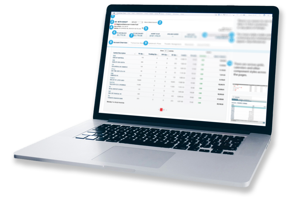
Compass is National Bank’s wealth management SaaS platform used by investment advisors and analysts to manage securities research, onboarding, administration, trading and compliance workflows. It consolidates multiple complex tools into one system, streamlining automated workflows within a highly regulated, accessibility-driven environment.

Less Clicks, More Accurate Results.
Advanced Security Search Feature Redesign → Redesigning the core search feature to reduce abandonment, clarify filters and improve search results.

Wireframes: Designed simplified workflows for filters and results display, exploring incremental filtering and dynamic suggestions.
Prototypes: Built high-fidelity prototypes in Figma, validated with advisors and analysts, iterating based on usability feedback.
Research: Conducted comparative analysis of Bloomberg and Globe Investor; created user journey maps and facilitated interviews; synthesized insights into a research findings report.
Collaboration: Led discussions with cross-functional teams including business analysts, management and developers to align on pain points and opportunities.


Impact.
Increased usability of the Advanced Security Search, resulting in a more efficient and satisfying user experience, increased retention and revenue opportunities.
Improved user engagement metrics, with increased search interactions and a significant decrease in search abandonment rates.
Reflections.
Cross-functional collaboration with developers and analysts is key to aligning design goals with technical constraints.
Designing for complex financial data required balancing usability with strict regulatory and accessibility standards.
Design System / Audit
My Role: UX Designer
Guiding Principles: Used Nielsen Norman Group’s 10 Usability Heuristics as a framework to evaluate and improve Compass's user experience.
Objective: Conducted a UI/UX audit to identify inconsistencies and usability issues. Collaborated with stakeholders to implement actionable design improvements.
Process:
Conducted a detailed UI/UX audit across multiple modules, identifying inconsistencies and usability pain points in a large-scale financial SaaS platform used for uploading, searching, and analyzing complex financial instruments and data.
Collaborated with stakeholders, including developers and business analysts.
Designed and documented a roadmap for a scalable, standardized design system.
Key Findings & Solutions
Inconsistent standards: Varied patterns and naming → solved with a unified design system.
Unclear messaging: Vague errors and icons → replaced with clear, action-oriented labels and tooltips.
Layout inefficiencies: Cluttered screens and poor hierarchy → optimized with consistent typography and progressive disclosure.

Impact.
Improved usability and task efficiency with clearer navigation and UI standards.
Decreased search abandonment rates by improving labeling and findability.
Strengthened design system for long-term scalability.
Reflections.
By applying usability heuristics, we created a scalable, user-friendly experience that enhances efficiency and engagement.
Visual Design at NBIN
NBIN Annual Conference Campaigns
NBIN's Annual Conference goal is to bring finance community to network with NBIN's top executives, thought leaders and fin tech professionals.
60-Foot Immersive Event Displays
I led the creation of the campaign’s key visual styles and designed all major touchpoints for the events, including 60-ft immersive displays, mobile app assets, booth graphics and print materials, delivering a cohesive and recognizable experiences.


